Accessibility
How we built an accessible website
Accessibility was the number one priority in the design of the Blind Veterans UK website, and a major consideration in the look and feel we’ve developed with our digital partner, Reason Digital.
We’ve worked to make sure that the site is easy to navigate and that the design of the core information areas is simple and clean, ensuring content is easily read and accessed by everyone.
We have designed this website with vision-impaired users who are not yet supported by our charity in mind. Our research shows us that these users may also be struggling with mental health issues and cognitive impairments, and may be visiting our site using older technology. By doing this, we feel we’ve created a better design for all our other users too.
Following extensive testing by accessibility experts AbilityNet, our website has received ‘Accredited Plus’ certification, the accessibility charity's flagship accreditation. This means it is not only compliant with the required standards of WCAG - AA guidelines, but is also 'real life accessible', demonstrated through testing by a representative sample of disabled users.!
Our audience
We recognise that the Blind Veterans UK community is diverse and is made up of:
- those living with a vision impairment
- their family and friends
- healthcare practitioners
- other sight loss and disability organisations.
We also know that most of the veterans we support are elderly, with an average age of 85, which was a key factor in our website design.
Sight loss journey
We know the needs of people with a vision impairment will change as their sight loss journey progresses. Typically, people move from early adjustment to their condition after being diagnosed, to engaging in rehabilitation and training, and then readjusting as their sight loss changes over time. We want our website to work for them at every stage of that journey.
Catering for all users
We also want our site to provide the same rewarding and informative experience for those without a vision impairment. These people are often representing our beneficiaries or potential beneficiaries, and we want to ensure they can access the information we provide and fully engage with our charity.
Rejecting accessibility tools
We’ve researched, considered, and ultimately rejected the use of a full suite of accessibility tools.
Our approach was to design a fully accessible website from the outset, rather than trying to make it accessible using add-on tools. We have and will continue to test this approach with users with a vision impairment to ensure we cater for everyone in our community.

Our research
We spoke to vision-impaired veterans, their partners and spouses, and our own staff and volunteers about their needs when we were designing our website. From this research, we learned the following.
Users with screen readers and magnifiers
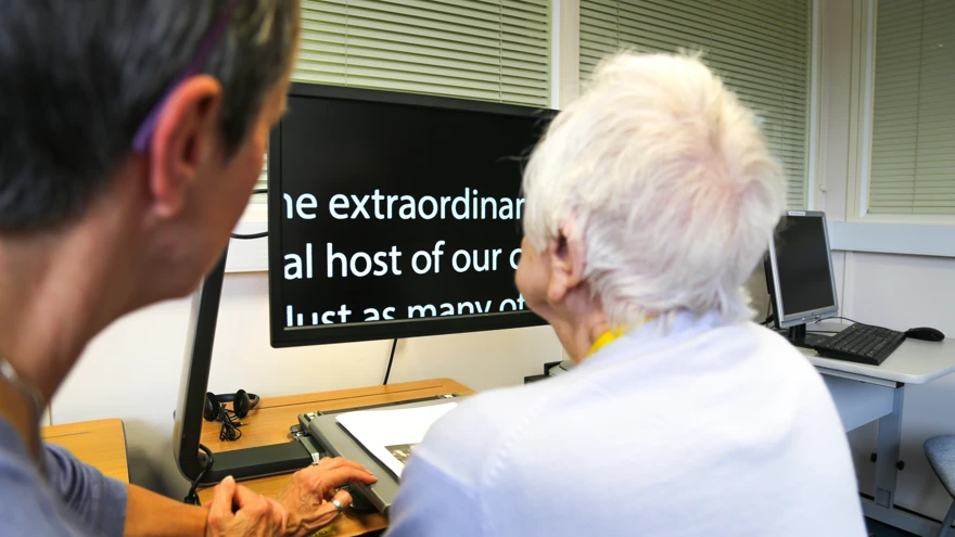
Some vision-impaired users of our site will use screen readers, which read everything on the screen aloud. But not all of our audience use this technology. If users have low vision rather than no vision, they might be using screen magnifiers. Magnifiers enlarge the screen, meaning much less of the screen is seen at any one time.
This can present challenges, for example, it can feel as if users are seeing the site through a keyhole. They have to work out where sections and links are one word at a time, and try to figure out where things are located within the page. To deal with this, we have adopted a clear and simple visual design to help those using screen magnifiers.
Users with cognition difficulties
Many of our website users are prospective beneficiaries. From our research, we know that many blind veterans are in crisis before they join our charity. They are often suffering from extremely poor mental health and may be in denial about their access needs. Because of this, we have ensured that our site has a very low cognitive load. This means that it is easy to process and understand, and can be used without accessibility tools and on-screen adjustments. Poor mental health can affect cognition, and we want to ensure that all of our users can fully access and engage with our website.
Elderly users
The age of our users was a key factor in the design of this website. The average age of our veterans is 85, and their partner or spouse is likely to be elderly too. Our beneficiaries are also likely to have comorbidities like cognitive impairment, mobility issues and hearing loss, and reduced confidence with technology. If they are regularly using a computer, it is tends to be an older desktop or tablet rather than a smartphone, and they are often also using an older browser.
We’re also expecting younger, more technically confident users – who may or may not have a vision impairment – to access our site on behalf of their loved ones. We also want to provide them with the best experience possible of both our website and the Blind Veterans UK brand.
“We approach every project in a user-centred way. Accessibility shouldn’t just be hitting the right guidelines to achieve a tick-box WCAG – AAA rating, but to understand the specific needs of the audiences using your site. Great visual design enables readability, minimises cognitive load and brings simplicity.”
Design and UX Director, Reason Digital

Making the site easy to understand
We've build this site with cognitive load in mind. Cognitive load refers to the mental energy needed to process and understand something. We've created a design with low cognitive load, so it's easy for all users to navigate.
Factors such as stress, age, fatigue and illness can affect your cognition. We've taken this into account by opting for a clear, simple website design that is easy to interact with. We've ensured that there is plenty of white space and broken up text with images and graphics to avoid overloading the page and overwhelming the user.
We have used clear, concise everyday language to ensure users can quickly and easily understand what we are saying. And we've structured our pages with clearly defined sections, using headings and subheadings, to ensure that the reader can easily find the information they need.
We also avoided using common website features like tickers, transitions and complicated forms as these increase cognitive load.
Find out more
If you would like to talk to us about our approach to accessible design, please contact us by clicking the button below.
Sign up for email updates
We would love to keep you updated about our activities, services and ways to support us.
You can change your contact preferences at any time by calling us on 0300 111 2233 or emailing us. See our privacy policy for more details.

